





Paul Rand



Father of Modern Graphic Design · Pioneer of Typography Revolution
Paul Rand (1914-1996) was one of the most influential designers of the 20th century. His work encompassed brand design, typography, advertising, and corporate identity systems. His design principles, color theory, and typographic aesthetics profoundly influenced generations of designers.

Paul Rand was born in New York and graduated from Parsons Design School in 1936. He began his career in advertising and magazine design in the late 1930s and 1940s, quickly becoming a key figure in the international modern design movement.
He established his own design studio and collaborated with many renowned companies, including IBM, UPS, Enron, and ABC. His work consistently adhered to the principle of "less is more," emphasizing the perfect combination of functionality, simplicity, and aesthetic beauty.
After 1953, Rand served as director of Yale University's Design Department and published several important works, such as "Thoughts on Design" (1947) and "Paul Rand: A Designer's Art" (1985), which became classic texts in design education.
Rand pioneered extending logo design into complete corporate identity systems. He didn't just design standalone logos, but created comprehensive systems including typefaces, colors, and layout standards, ensuring consistency and recognition across all brand applications.
"Less is more" became the golden rule of modern design. Rand proved through simplified forms, precise color and typography use, that simple designs often have the strongest visual impact and memorability. This principle profoundly influenced all subsequent design fields.
Rand systematically articulated typography principles and standards, including letter spacing, line spacing, and font selection. He emphasized that typography is not merely text placement, but an important means of creative expression. His typography theory became the foundation of modern design education.
Rand conducted in-depth research on how visuals efficiently communicate information. Through precise form, color, and composition principles, he established systematic visual communication theory, becoming the basic standard for advertising and packaging design.
Rand reformed both the content and methods of design education. He emphasized the importance of design thinking, design rationale, and business application, transforming design education from pure art into professional education combining theory, practice, and business awareness.
Rand was a key figure in introducing Swiss International Style to America. He synthesized European modernism and American pragmatism, creating a unique American modern design style, and elevating American design's international standing.
Through writing, teaching, and practice, Rand systematically elevated the professional status of design. He proved that design is not decoration, but a professional discipline with real commercial value, transforming designers from craftspeople to knowledge professionals.
Rand developed systematic theory for color combinations and form composition. His work demonstrated how color evokes emotion and form guides vision, theories that profoundly influenced modern design, art direction, and brand design.
Paul Rand deeply understood the crucial role of typography in visual communication. He emphasized that typography cannot be considered merely from a decorative perspective, but must be approached from both information delivery and aesthetic dimensions.
He proposed fundamental typography principles that should be followed: alignment, balance, contrast, rhythm, and unity. These principles remain the golden rules of typography design today.
When selecting typefaces, Rand always considered not just the form, but primarily whether it could accurately convey brand personality. He believed that "the right typeface is a cultural choice with personality and meaning."
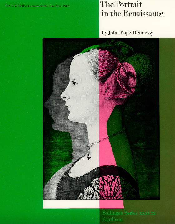

Rand championed rational and functional typeface selection. He favored clear, legible, and modern sans-serif typefaces, while emphasizing that typefaces must possess personality and aesthetic value.
His writings and practice influenced 20th-century typeface design philosophy. He proved that typeface selection is not arbitrary, but requires thoughtful strategic decision-making.
In projects like IBM, Rand used custom or carefully selected typefaces as part of a complete corporate identity system, establishing the strategic value of corporate typeface selection and influencing the development of all subsequent brand typography systems.
Typography's primary task is to communicate information clearly. Aesthetics must be built on the foundation of legibility.
Whitespace is not waste, but a key design element. Appropriate use of whitespace elevates the quality and legibility of typography.
Create visual hierarchy through size, color, and weight contrast, guiding the viewer's attention.
Typography should follow consistent system rules, ensuring consistency and professionalism across various media.
Typeface and typography choices should reflect the personality and values of the brand or subject matter.
Form follows function. The best design achieves functional goals while maintaining aesthetic value.

The IBM brand identity is Rand's most representative work. The complete system he created, including logo, typeface, color, and typography standards, became the model for modern corporate brand identity systems. The sleek blue striped logo is deeply embedded in the minds of consumers worldwide.

The iconic brown and gold color scheme and shield-shaped logo communicated concepts of safety, reliability, and professionalism through simple form. This design has maintained its vitality for over 60 years, validating the timeless value of Rand's design.

The iconic circular ABC letter mark is simple yet creative. Rand transformed simple geometric forms into a powerful visual symbol, demonstrating his ability to reduce form to the essence while maintaining personality and recognition.

Although Enron later became infamous for scandal, their brand identity system showcased Rand's design thinking in his later years. The simple typeface combinations and color pairings exemplify the essence of modern corporate design.

The cubic logo Rand designed for Steve Jobs's NeXT computer became iconic. This work demonstrated how Rand combined modern geometric forms with technological feeling, creating a visual identity that was both cutting-edge and timeless.

This classic work systematically articulated design principles and methods. The typography, layout, and visual presentation of the book itself exemplify design theory. This book has had a profound influence on modern design education.
Paul Rand often used Helvetica, a sans-serif typeface known for its clean and simple structure. Helvetica is easy to read and has a neutral and balanced appearance. It does not include decorative details, which makes it very effective for clear communication. Because of these qualities, Helvetica is widely used in branding, advertising, and corporate design.
From my perspective, the use of Helvetica shows a strong sense of commercialization and modern industrial style. The font feels professional, efficient, and suitable for business environments. Its simplicity helps deliver information quickly and clearly, which is very important in modern design.
In addition, I think Paul Rand’s overall design style combines bright, high-contrast colors with simple layouts. Even when he uses strong colors, his work still looks clean and not complicated. His designs are easy to remember, which is a key factor in successful branding. In my opinion, this balance between simplicity and strong visual impact is one of the reasons why his work is so commercially successful.